
Introduction
Prerequisites
Appreciation for all things shiny.
Magic effects in video games are sweet, but do you know what’s even sweeter? Knowing how they work so you can make your own. That’s what we’re going to do here. We are going to learn how to make awesome looking sprites in Maya so we can bring them into the Unreal Development Kit for our own special effects. First we’ll take a look at what sprites are, followed by how to render optical effects using a spot light in Maya. Next Photoshop will be used to touch up and save out our images for import into the Unreal Development Kit. Follow me and we’ll “get our learn on”.
Sprites are single polygon planes who’s surfaces are mapped with an image. For visual effects these sprites are usually programmed so they always face the active camera. This means however you look at a sprite in 3D space it will  (http://www NULL.terrymatthes NULL.com/wp-content/uploads/2011/01/p_101_spriteTex_tree NULL.jpg)always be facing directly towards you no matter where it’s positioned. Sprites give an accurate enough representation for a variety of visual effects. Things like snow, muzzle flashes, and small pieces of flying debris look the same no matter what angle you view them from. Even visual effects such as lightning are so quick that you wouldn’t even notice that the effect isn’t truly “3D”. If this is the case then why would we bother giving these effects any extra dimensionality?
Sprites are also simple to render. If all your sprites are single polygon planes you can afford to have a lot of them on-screen at the same time. Throw enough of them together and you can get some pretty realistic looking effects for a lot cheaper then pre-rendered graphics. The picture to our left shows a tree who’s leaves are made of a few larger sprites. No matter which way the camera looks at the tree the leaves appear to be full of volume.
Maya
Point Light Optical Effects
The optical sprite we are creating will be based off a point light. Once created the point light will be manipulated via the “Optical Effects” node to give our light different properties. To do this access the “Create” menu at the top of the screen. Navigate to Lights>Point Light and select it. You should now have a point light at the origin of your axis. The optical effect we are after is not visible by default on our point light. We have to turn it on in the Attribute Editor (ctrl+a). Select the point light and access the Attribute Editor. Under the “pointLightShape1” tab we are going to expand the “Light Effects” section. In this section the last option is “Light Glow”. Turn this on by clicking the checker board button on the right of the text field. If you’ve done this correctly you will see a circle around your light and the Attribute Editor will have jumped to the properties for the “opticalFX1” node you just created. Our point light is now set up to cast some great looking optical effects.
Render Camera Setup
 (http://www NULL.terrymatthes NULL.com/wp-content/uploads/2011/01/p_101_spriteTex_scene NULL.jpg)Go back to the “Create” menu and navigate to Cameras>Camera and select it. You should now have a new camera also sitting the axis origin. Select your new camera and Move (“w” key) it away from the origin. Now that we’ve finished placing our new camera we will go ahead and look through it. Select the new camera and in your view port menu navigate to Panels>Look Through Selected Camera. You should now be looking straight at the point light we created. The last thing we want to do to our camera is make the “Resolution Gate” viewable. This will let us see the bounds of our render. To do this we will use our view port menu and select View>Camera Settings>Resolution Gate.
By default your resolution is probably not square. We need to make it square so we can use the images we create in the Unreal Development Kit. To change this let’s go ahead and navigate to the “Render Settings” through Window>Rendering Editors>Render Settings. Change your settings to match these options (http://www NULL.terrymatthes NULL.com/wp-content/uploads/2011/01/p_101_spriteTex_renderSettings NULL.png). With that setup we are now ready to start rendering out some optical effects.
Rendering Optical Effects
The optical effects we are using render out very fast. This will enable us to view near real-time previews while changing the visual settings. To view our render we are going to open up the “Render View”. This can be accessed through the main Maya menu: Window>Rendering Editors>Render View. In the Render View menu select IPR>IPR Render>camera1. This will setup interactive rendering on the camera we created earlier. The last step to setting up IPR is to marquee drag over the entire renderable area. When you do this the edges will become red. Any changes you make to the opticalFX node will now be instantly seen.
Important Note: Maya’s opticalFx are only viewable in “Maya Software” render mode. Make sure this is selected as your render mode in the Render View window
opticalFx Node Properties
If at anytime you loose focus of the opticalFX node you can access it by clicking on your point light, bringing up the Attribute Editor, and navigating the tabs at the top to find “opticalFX”. Right now you want to have your Render View open as well as your Attribute Editor with the opticalFX node tab viewable. The following section is a visual comparison of the basic opticalFX properties we will be dealing with in this lesson. There is a lot more you can do with this node than the sections listed below, but this is a beginner lesson so I want to keep things simple for now. Try experimenting on your own after to see what some of the other settings can do.
Optical FX Attributes
 (http://www NULL.terrymatthes NULL.com/wp-content/uploads/2011/01/p_101_spriteTex_Radial NULL.jpg)
 (http://www NULL.terrymatthes NULL.com/wp-content/uploads/2011/01/p_101_spriteTex_StarRadius NULL.jpg)
Glow Attributes
 (http://www NULL.terrymatthes NULL.com/wp-content/uploads/2011/01/p_101_spriteTex_GlowIntensity NULL.jpg)
 (http://www NULL.terrymatthes NULL.com/wp-content/uploads/2011/01/p_101_spriteTex_GlowIntensity NULL.jpg)
 (http://www NULL.terrymatthes NULL.com/wp-content/uploads/2011/01/p_101_spriteTex_GlowNoise NULL.jpg)
 (http://www NULL.terrymatthes NULL.com/wp-content/uploads/2011/01/p_101_spriteTex_GlowIntensity NULL.jpg)
 (http://www NULL.terrymatthes NULL.com/wp-content/uploads/2011/01/p_101_spriteTex_GlowIntensity NULL.jpg)
To save a render in the Render View you need to use the File>Save Image option. don’t get caught up colouring your optical effect as we will be stripping the colour from within Photoshop. When you are making your effects don’t forget that we can’t have parts of the star breaking the edge of our render. The images are going to be put on flat square sheets in the Unreal Development Kit. If the sprite images extend past the edge of the render they will give away our effect showing its 2D nature. When you have saved three renders that you are happy with move on it the next section.
Photoshop
Saving Sprites For The Unreal Development Kit
First let’s go ahead and create a New File (ctrl+n) if you haven’t already. Make sure it’s a square 512px file just like the images we rendered out of Maya. We want these to match up as we’ll be exporting this file for use in the Unreal Development Kit. Open (ctrl+o) all three of the sprite files you rendered out and change each of them to grey scale. We can do this by dropping the saturation of each file down to zero. While the layer in each file is selected access Hue/Saturation (ctrl+u). Now drag the “Saturation” slider all the way down to the left and this should drain the colour from your image. Before we jump into the next step I want to take a moment to explain what “Channels” are and how we can use them to our advantage.
Channels
 (http://www NULL.terrymatthes NULL.com/wp-content/uploads/2011/01/p_101_spriteTex_channels NULL.jpg)Each digital image is made of 3 different colours. You probably know what they are if you think hard… red, green, and blue. Photoshop stores this information in “Channel” layers. You can access these through the Channel tab in your layers window or through the “Window” menu. Each of these channels stores 8 bits of information. That means the value for each pixel in a channel is stored as a number from 0-255. As the value gets higher the pixel’s channel value becomes stronger.
In the “Layers” tab all these values are added up for each pixel and you get the full colour view you see as the image. A pixel with a value of 255 in each category would be represented as a compiled colour of pure white. A pixel with channels values of R(255) G(0) B(255) would compile as purple. So what does this have to do with what we’re doing? We’re just saving out pictures for sprites, right? Yes, that’s correct, but we’re saving black and white versions of our sprites, as we will be manipulating the colour from within the Unreal Development Kit in our next lesson. This means that the actual compiled colour of our texture doesn’t matter. This is going to let us store 4 different sprites in one file! Yes that’s right I said “four”. We can add an “alpha” channel to our Photoshop file and get one extra channel.
So now that we know all about what channels are and how we can use them let’s start putting our sprites in our new file’s channels. Go ahead and Copy (ctrl +c) one of the desaturated sprite images from your open files. Navigate (ctrl+tab) to your “new document” and access the channels information. In your new document all the channel information should be blank as you haven’t pasted anything in the layers section. Paste (ctrl+v) the sprite you just copied in a channel. The process is the same for all your other channels. Go ahead and copy the other two sprites you saved into the remaining red, green or blue channels. Remember: our final texture image isn’t important here.
 (http://www NULL.terrymatthes NULL.com/wp-content/uploads/2011/01/p_101_spriteTex_gradient NULL.jpg)The alpha channel in our texture will not have a sprite. We are instead going to insert a circular gradient that will help us control the look of our sprites from within the Material Editor. Select your Gradient Tool (“g” key) and make sure your foreground colour is black and your background colour is white. Also be sure that the “radial gradient” option is selected atop Photoshop. Navigate to your channels tab and press the “Create new channel” button. This will give you an alpha channel to drag out our gradient in. Select this channel and from the middle drag out to the edge and let go to create your circular gradient. When you have finished save your Photoshop document as a Targa file under the “Save As” section of the “File” menu. When presented with your options for the Targa format select “32 bit”. This will save the file with the extra alpha channel. Remember that each channel is 8 bits so a 24 bit Targa holds 3 channels and a 32 bit will hold 4.
Conclusion
Don’t those sprites we made look awesome? Maya’s optical effects node can get you a lot of different looks so have fun an experiment to see what you can come up with. Try mixing multiple sprite images together within Photoshop and using their combined values in a single channel. Now that we know how to make magic sprite shapes and have saved them out in an efficient format we can take them into the Unreal Development Kit. In our next lesson we’ll use our sprite texture as a base for controlling the look of our sprites through a material network.
Here are the three sprites I will be using in the next lesson about our material controller. Just for fun I thought I would add some colour to them in Maya :)
 (http://www NULL.terrymatthes NULL.com/wp-content/uploads/2011/01/p_101_spriteTex_mine NULL.jpg)
.
Further Reading
Sprite Material Controller
Make a Particle Explosion Effect by Mike McClelland
Sprite Rendering Fundamentals The Gnomon Workshop
Pixie Dust Using Sprites The Gnomon Workshop
Program Shortcuts Used
Maya
Move (“w” key)
Attribute Editor (ctrl+a)
Photoshop
New File (ctrl+n)
Open File (ctrl+o)
Hue/Saturation (ctrl+u)
Navigate Documents (ctrl+tab)
Paste (ctrl+v)
Copy (ctrl+c)

 (http://www NULL.terrymatthes NULL.com/wp-content/uploads/2011/04/beer_ice NULL.jpg)I dug up a scene I had modeled a few months back of my old apartment. This is lighting s a test to see how I would like to take the render further. The render itself is black and white and the few textures and colours in it were added in Photoshop. I should mention that I’m not using the mia_roundCorner node. There are 5 area lights in the scene being controled by a mia_portal_light. Right now the large windows are emitting 1,000,000 photons per light and the smaller windows are emitting 500,000. The portal lights are all connected to the same mib_blackbody node which is outputting a colour temperature of 5500K. This is in an effort to simulate mid-day sun. The render camera is set up so that the film back is the same ratio as the resolution gate (960×540 px) and I added the lens shader mia_exposure_photographic to even out the gamma. I am still getting a bit of blotchyness around the corners, but part of that is due to the area light samples being set at 16. Overall I am really happy with this as a test and I will keep posting updates as my work progresses. I’ve also done a small linear light test with a beer can model and I
  (http://www NULL.terrymatthes NULL.com/wp-content/uploads/2011/04/apt_test NULL.jpg)
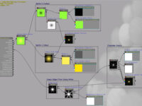
 (http://www
 (http://www
 (http://www
 (http://www
 (http://www
 (http://www
 (http://www
 (http://www
 (http://www
 (http://www
 (http://www
 (http://www
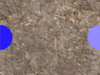
 (http://www
 (http://www
 (http://www
 (http://www
 (http://www
 (http://www