« Posts tagged apartment

[Client] Wayfair: V-Ray Sofa

Texture Detail of Couch

The couch was the focus in this scene for me. It was part of a small contract for Wayfair. Their 3D Generalist broke his arm while on vacation and they needed a CG model made of their Novagratz Brittany Sofa. I was given photos of the couch and asked to model and surface it for their web catalogue. I used Maya to create a stub mesh with proper dimensions then took everything into Zbrush to be sculpted. The rest of the meshes were purchased off of Turbo Squid. I then created the materials for all objects in the scene. The last steps were to light, render and finally composite the scene in Nuke. I rendered the scene using Vray. Almost all of my previous modeling was done by creating a scale stub in Maya and then working it out in ZBrush. 3DSMax is a different beast altogether when it comes to modeling. Thankfully VRay seems to work in a similar fashion from within 3DSMax as it does in Maya. I still don’t quite understand the new ‘Slate Material Editor’. It seems that materials I create from within the Slate editor don’t show up in the Compact editor and vice versa. Most of my shaders don’t require crazy node networks so I’m happy using the simplified editor.
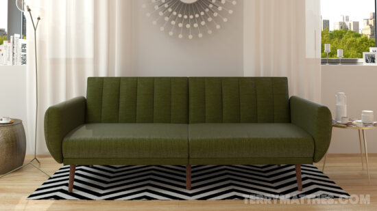
LoftInterior_Web2 (http://www NULL.terrymatthes NULL.com/wp-content/uploads/2018/01/LoftInterior_Web2 NULL.jpg)

A lot of the time developing this scene was spent on the couch’s material. I wanted to make sure the linen came through really strong and crisp. Rendering the couch without losing the detail in the bump was my main concern. I ran with a 4K diffuse map and a 4K bump map to create most of the detail in the material. A spec map was also used to control how the highlight spread over the couch’s surface. The raw render is 4000×2666. Below is detailed snipped of the full resolution render.
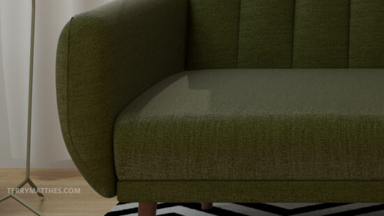
Texture Detail of Couch (http://www NULL.terrymatthes NULL.com/wp-content/uploads/2017/07/detail NULL.jpg)

Most of the folds and creases in the couch were created in ZBrush. I didn’t want to add too much wear and tear to the couch as it was designed for use in a product shot. Usually I would render out a default material pass to show the shapes in the scene, but this Global Illumination pass does a fine job.Sofa Interior Global Illumination (http://www NULL.terrymatthes NULL.com/wp-content/uploads/2017/07/couch1920GI NULL.jpg)
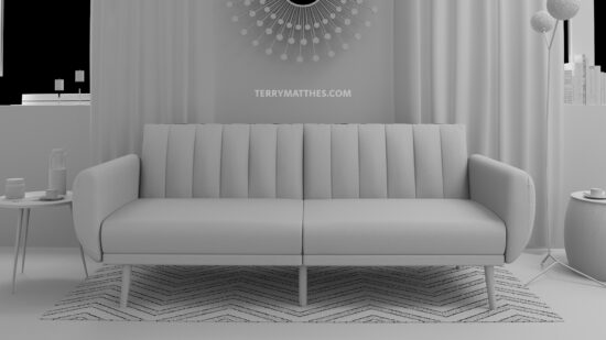
I haven’t had a chance to use the UVW pass on this shot, but I would like to play around with it in the future. The idea of being able to assign a new texture to the couch in post sounds really cool. I think it could have some really useful implications for product rendering. I’ve been thinking more and more about exteriors lately and I think I might try to model an outside scene in the near future. For now I’ll leave you with render passes created in 3DSMax for Nuke below.
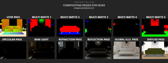
Passes for compositing interior scene in Vray (http://www NULL.terrymatthes NULL.com/wp-content/uploads/2017/07/NukeCouchPasses NULL.jpg)

Late Night With Mental Ray

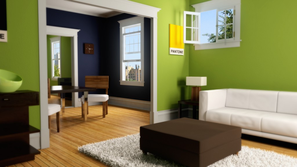
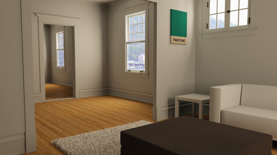
(http://www NULL.terrymatthes NULL.com/wp-content/uploads/2012/09/TMNIGHT2 NULL.jpg)I have wanted to try a late night render for some time and I got an excuse to do so recently. A lot of the time went into getting the final gather and global illumination to behave correctly.  There are two area lights outside the windows lighting the scene along with the two point lights; one in each lamp. The lamp’s point lights have their colour temperature controlled by a mib blackbody node set to around. The floor panel is a flat plane using a 2D bump (no normals) to pop out the individual floor planks. Underneath it, a wood texture to support this.

The ottoman in the middle of the room is procedurally textured using the 2D Texture Cloth node to create a fine bump across the surface as well as to define the diffuse colour of the fabric. Some unevenness is applied to the 2D Placement Node of the ottoman’s material to simulate uneven stretching of the fabric. This effect is applied subtly though. A stronger effect is the light shining through the surface of the lamp shade. This was achieved through using Maya’s default translucent property on a simple lambert shader. A yellowish colour was then picked for the diffuse and I turned down the diffuse value of the material to around “0.4”. The area light to the right of the scene is colored with a dim blue light to simulate the way your eyes desaturate colours in low light conditions. A blue tint was also added afterwards to the whole image in Photoshop. To achieve the final gather I wanted I used three point lights that didn’t cast diffuse or specular light. These point lights simply cast photons (around 300k each) to paint the rooms with final gather points. One point light was placed in the middle of each room. Before rendering I made sure to save out both my final gather and global illuminations passes. The cat on the couch was done using Maya’s native fur system. If I were to change anything I think I would paint a custom fur length map for the cat so the hair wasn’t the same length all over.

In Photoshop I applied an ambient occlusion render over the entire image, set it’s opacity to around 30% and changed  it’s layer’s draw type to multiply. I rendered this image out and an EXR and it gave me the ability to really pull the values of the scene in a wide range due to the raw nature of an EXR. To select the individual objects in the scene I rendered out a mask pass to make selecting the individual elements of the scene much easier. The mask pass was made as a separate render layer. I made 5 different Maya surface shaders and labeled them: red, green, blue, black, and white. I then applied these shaders to everything in the scene and made sure that no to objects with the same colour overlapped.

If anyone has any questions feel free to comment below or to contact me about the questions. Have a nice day :)

Apartment Final Render Thoughts

For now I’m finished with this apartment render. I’ve learned a lot, but it’s time to move on to another project. I will definitely revisit this in the future as I learn more about Mental Ray. I think the most challenging part for this project was fine tuning the global illumination and final gather settings. This is the first time I have worked with either. The fur system was really easy to use and while there are a lot of settings most of them just let you add randomization to the basic properties. The fur and fabric shader on the ottoman required a lot of anti aliasing to catch-all the crisp detail.

The final settings for anti aliasing in the “quality” tab were set to “adaptive” and 4. If I did it again I would have set the final quality control to 3 as I found 256 samples is a little over kill and takes almost twice as long as when set to 3. Keep in mind though that the setting is not “mandatory”. That means that not every pixel is getting 256 samples, just the ones that Maya determines need it. I’m not quite sure how the algorithm works that controls this, but it is something I plan to look into. In retrospect I don’t think I would ever paint a room that bright of a green, but you must have fun with these kinds of projects; right? :D

On a side note, I was at the gas station the other day and while I was waiting in line I found a great magazine called “Elle Decor” (http://www NULL.elledecor NULL.com/). I’m pretty sure it’s aimed at women, but it’s got a ton of really sweet interior designs inside that are giving me lots of inspiration. More posts soon. If you have questions ask away.
(http://www NULL.terrymatthes NULL.com/wp-content/uploads/2011/06/apt1 NULL.jpg)

Apartment Render Update + Maya Fur

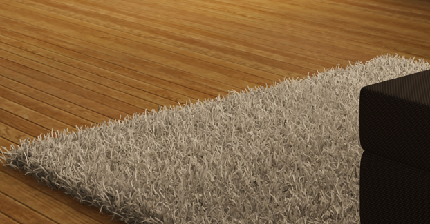
Detailed Portion of the Full Resolution Render

I’m just about 70% done my apartment render so I thought I would post an update. This is a to scale model of my old apartment. I had some previous renders, but the scale was off (really off) and it was causing all my lightning to be blown out. After Fixing the scale I noticed I was getting black renders even though Global Illumination and Final Gather were working properly. The issue was that my portal light’s intensity wasn’t near strong enough. I had to jack it up to about 2 billion! Crazy. I eventually toned it down to 1 billion, but anything under that and the light really dies off quickly.

As far as assets go I have modeled a sofa table and television which don’t appear in this render, but they will be in the next one. I think I’m also going to take out the couch for now because I just ordered one of the best leather sofas (http://fineleatherfurniture NULL.com/leather-furniture-blog/blog-list/513-the-best-leather-furniture-manufacturers-quality-not-quantity) to replace it, and I don’t have the space needed or time to give the old couch model the love it needs.
The shag carpet was really fun to work on. I’ve never used the Fur System in Maya before, but after the Introduction To Maya Fur (http://www NULL.digitaltutors NULL.com/11/training NULL.php?cid=42&pid=264) on Digital Tutors (http://www NULL.digitaltutors NULL.com) I really was excited to give it a try. I used carpet texture on a plane and told the fur system to grab its base and tip colours from that. going forward I think I might make the base and tip of the fur a little thicker. Other options were played with such as “scraggle”, “poll”, and “inclination”. It’s worth noting that under the Fur Feedback Description node there is a section called “Details”. Under this section you can add randomness to all the attributes. If you’re interested in all of the different fur properties there is a good textual resource over at http://caad.arch.ethz.ch/info/maya/manual/MayaFur/UserGuide/2CreatingFur.fm.html#176880 (http://caad NULL.arch NULL.ethz NULL.ch/info/maya/manual/MayaFur/UserGuide/2CreatingFur NULL.fm NULL.html#176880)

When it came to picking a backdrop I just grabbed something off of Google image search for the time being. I quickly used the layer properties of the render in Photoshop to drop out the windows as they were solid white. For the final shot I think I’ll climb my old fire escaped and snap a shot with my Wife’s camera. She has a nice Cannon 40D. I don’t plan on using HDRI for image based lightning just yet, but maybe I will set myself up so I can experiment with that another time :)

One thing I did notice in the render was the aliasing lines in the ottoman’s fabric. The lines stayed there when I raised the anti-aliasing to adaptive sampling set @ 64 samples. They went away when I tested that area with 256 adaptive samples.

At any rate here is the shot and if you have any question just ask in the comments or fire me an email. I’m around computers all the time so I respond fairly quickly to questions. I’m going to have this done in the next couple days so expect a finished post soon. I will also include depth of field in the final render. Above the full scene render is a detail render of the scene at full scale.
Detailed Portion of the Full Resolution Render (http://www NULL.terrymatthes NULL.com/wp-content/uploads/2011/05/detail NULL.jpg)

.

Apartment Render Test 02 (http://www NULL.terrymatthes NULL.com/wp-content/uploads/2011/05/apartmenttest2 NULL.jpg)