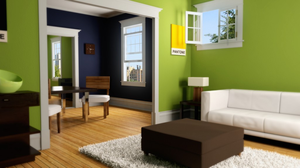
For now I’m finished with this apartment render. I’ve learned a lot, but it’s time to move on to another project. I will definitely revisit this in the future as I learn more about Mental Ray. I think the most challenging part for this project was fine tuning the global illumination and final gather settings. This is the first time I have worked with either. The fur system was really easy to use and while there are a lot of settings most of them just let you add randomization to the basic properties. The fur and fabric shader on the ottoman required a lot of anti aliasing to catch-all the crisp detail.
The final settings for anti aliasing in the “quality” tab were set to “adaptive” and 4. If I did it again I would have set the final quality control to 3 as I found 256 samples is a little over kill and takes almost twice as long as when set to 3. Keep in mind though that the setting is not “mandatory”. That means that not every pixel is getting 256 samples, just the ones that Maya determines need it. I’m not quite sure how the algorithm works that controls this, but it is something I plan to look into. In retrospect I don’t think I would ever paint a room that bright of a green, but you must have fun with these kinds of projects; right? :D
On a side note, I was at the gas station the other day and while I was waiting in line I found a great magazine called “Elle Decor” (http://www NULL.elledecor NULL.com/). I’m pretty sure it’s aimed at women, but it’s got a ton of really sweet interior designs inside that are giving me lots of inspiration. More posts soon. If you have questions ask away.
 (http://www NULL.terrymatthes NULL.com/wp-content/uploads/2011/06/apt1 NULL.jpg)
, Doty /
Very nice. Very nice indeed, I like the couch and carpet very muchly.
, nixin (http://nixinstudio NULL.ca/blog) /
This render is pretty sweet but I would like to see some blurry reflections on the floor if thats not to much to ask for ;)
, Terry (http://www NULL.delightning NULL.com) /
I think if I increase the reflectivity of the floor and not just the specular value the blurry reflections should show up. I’ll give that a try for my next floor.
, Doty /
So I was examining your render again because it’s awesome and I wanted to ask how much ‘Photoshop’ was used in the final piece. I ask because (and don’t take this the wrong way) it has a surreal, glow-y, slightly out of focus look to it — somewhat reminiscent of your kitchen render you did when we were in college (which was also badass). And if you didn’t overly ‘shop’ it in post, then what filter did you render with in Mental Ray? Was is a blurring filter like Box or Gaussian? Or did you use one of the sharpening filters like Mitchell or Lanczos? Because your lighting is spot on and your texture painting is great but yet it still has that distinctive 3D look to it (not that that’s bad).
, Terry (http://www NULL.delightning NULL.com) /
For the final image there is a Mitchell filter set to 1.5 The soft edges are created in post as is the glow. For the soft edges I duplicated the layer then Gaussian blurred the top layer by 1.5. A circular gradient mask is then applied to that layer so the soft image drops off towards the middle. For the glow around the windows I Select the cutout shape of the windows and then copy the pixels that match this from the background layer. I then paste these pixels infront and give them a really large blur (45 or so).
I’m in the middle of moving, but after I get internet setup at home (I’m at work right now) I will email you a picture of the untouched render from maya so you can take a look at what I started with.